Navigations / Menus
 |
| Typical navigation |
 |
| Hot zone for thumb |
Typical navigations like the above would no longer be applicable to your touch screen application. The reason is simple – human’s fingers are fat and this type of menu would require the precision of using a mouse. So what can be done?
Placement of navigation menu
Research has shown that for iPhone, there is a hot zone that
your thumb would reach at ease. Generally speaking, with that research, it is
fair to claim that your menu is more appropriate at the lower half of the
screen than at the top.
Furthermore, if you were to place the navigation at the top
of the screen, it would possibly create inconvenience to the user as the user’s
hand will obscure the contents if the user would to attempt to access your
menu.
Hence, for iPhone, our advice is to place the navigation menu at the bottom. For devices with bigger touch screens, placement of navigation menu at bottom is fine too. Placing navigation at the right would be a better choice than left as research has shown that at least 70% of the population are right handers.
Behavior of navigation menu
With the presence of touch screen, designer can certainly explore different ways in which how navigation menu interact with user. Here are some
examples for your reference.
- “Pop-opens“: hidden menus that appear after a long press on a UI element – kind of like a ‘sticky’ dropdown menu
- “Drag-opens”: sliding menus that the user manually pulls open like a drawer, to access the info or elements within. These are nice, because return users can drag it partially open to only reveal the info/element that is needed, thus saving screen space overall.
Buttons
Earlier on, we mentioned that touch screen does not offer
the precision what a mouse can offer. Hence, here are some guidelines with
regards to buttons for touch screen. Fitts's law would definitely be applicable for design consideration as well.
- Appropriate buttons’ size to have the minimum size of 2*2cm, and the maximum of 4cm*4cm. Naturally, if your button size increases, do scale your font size as well.
- The space between buttons is recommended to me of the minimum of 3mm apart to the maximum of 6mm apart.
- Placement of important control button should be in the bottom navigation.
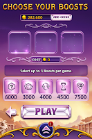
- Offer feedbacks as per how normal screen would react. For example when user’s hold onto the button, the button icon could have a change in color. Notice the example below, the "PLAY" button has a change in the color tone(second picture) when a user hold onto the button.
Concepts of familiarity
When designing for touch screen, always remember that the following gestures are what users will be familar with. Be sure to use them whenever you are deciding how does your application interact with the user!
Panning gesture
Entry state: One or two fingers in contact with the screen.
Motion: Drag, with any additional fingers remaining in same position relative to each other.
Exit state: Last finger up ends the gesture.
Effect: Move the underlying object directly and immediately as the fingers move. Be sure to keep the contact point under the finger throughout the gesture.
 |
| Panning gesture |
Entry state: Two fingers in contact with the screen at the same time.
Motion: Fingers move apart or together (pinch) along an axis.
Exit state: Any finger up ends the gesture or the fingers break the axis.
Effect: Zoom the underlying object in or out directly and immediately as the fingers separate or approach on the axis. Be sure to keep the contact points under the finger throughout the gesture.
 |
| Zooming gesture |
Entry state: Two fingers in contact with the screen at the same time.
Motion: One or both fingers rotate around the other, moving perpendicular to the line between them.
Exit state: Any finger up ends the gesture.
Effect: Rotate the underlying object the same amount as the fingers have rotated. Be sure to keep the contact points under the finger throughout the gesture.
 |
| Rotating gesture |
Two-finger tap gesture
Entry state: Two fingers in contact with the screen at the same time.
Motion: No motion.
Exit state: Any finger up ends the gesture.
Effect: Alternatively zooms or restores the default view for the object between the fingers.
 |
| Two-finger tapping gesture |
Press and tap gesture
Entry state: One finger in contact with the screen, followed by a second finger.
Motion: No motion.
Exit state: Second finger up ends the gesture.
Effect: Performs a right click for the object under the first finger.
 |
| Press and tap gesture |
Other guidelines that are useful
For touchscreen application, the general consensus is to use
bright colors as the background. Bright colors would reduce glare and helps
prevents the user from seeing fingerprints. Believe it or not, take your touch
screen devices and have a look at the applications available. Most of them
utilize light or bright colors. Off your screen, and you will be able to see
plenty of fingerprints of your phone.
If your application is content heavily – multiple page of
content – the principle of familiarity could be applied here. A gesture such as
swipe of the screen to the next page would certainly please the suprised user.
References


0 comments:
Post a Comment